
Data Analytics
How we turn raw air quality data into actionable insight
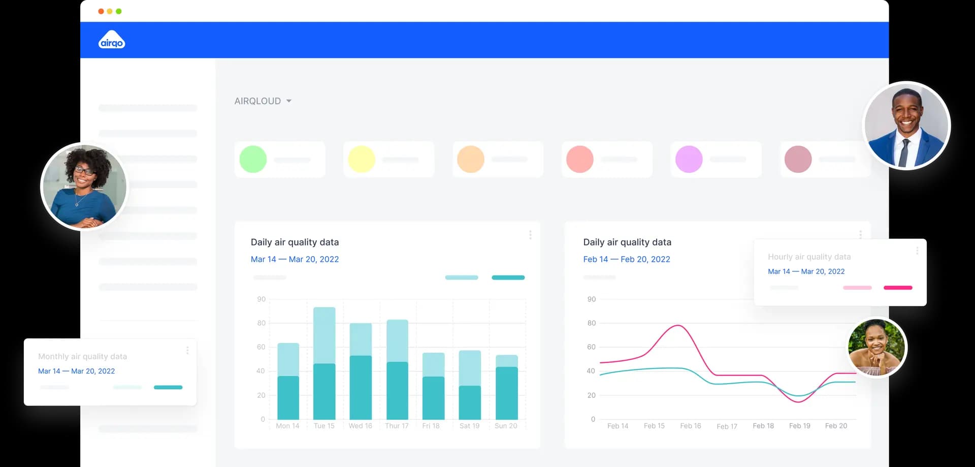
Our analytics layer blends AI models with domain expertise to clean, contextualize, and visualize air quality data for decision-makers. Every chart and alert is backed by transparent methods.
What “analytics” means here
Clean data pipelines, calibrated sensors, explainable models, and visual stories tailored to local policy and community needs.
Inputs
Continuous sensor feeds, weather and satellite layers, land use, traffic intensity, and historical baselines.
Outputs
Forecasts, exceedance alerts, health-relevant indices, and exportable visuals for reports.
Our approach
Data fusion
Combine sensor readings with weather, mobility, satellite observations, and emissions inventories for richer context.
Predictive modeling
Use machine learning to forecast pollution levels, fill gaps, and detect anomalies in near real-time.
Insight delivery
Serve dashboards, alerts, and exportable reports tuned to researchers, regulators, and communities.
What you get
Analytics outputs are ready for action—whether you are drafting policy, planning interventions, or informing the public.
- City and neighborhood air quality dashboards with trends and exceedances
- Forecasts to support planning around events, traffic, and weather shifts
- Automated QA/QC flags and anomaly detection for sensor health
- Report-ready downloads: CSV, charts, and embeddable widgets
Operational and transparent
Clear provenance, QA checks, and audit trails accompany every chart and forecast so teams can trust and act on the results.
Explainable
Show model drivers, data freshness, and uncertainty ranges.
Action-ready
Subscribe to alerts, export charts, and share links with stakeholders.